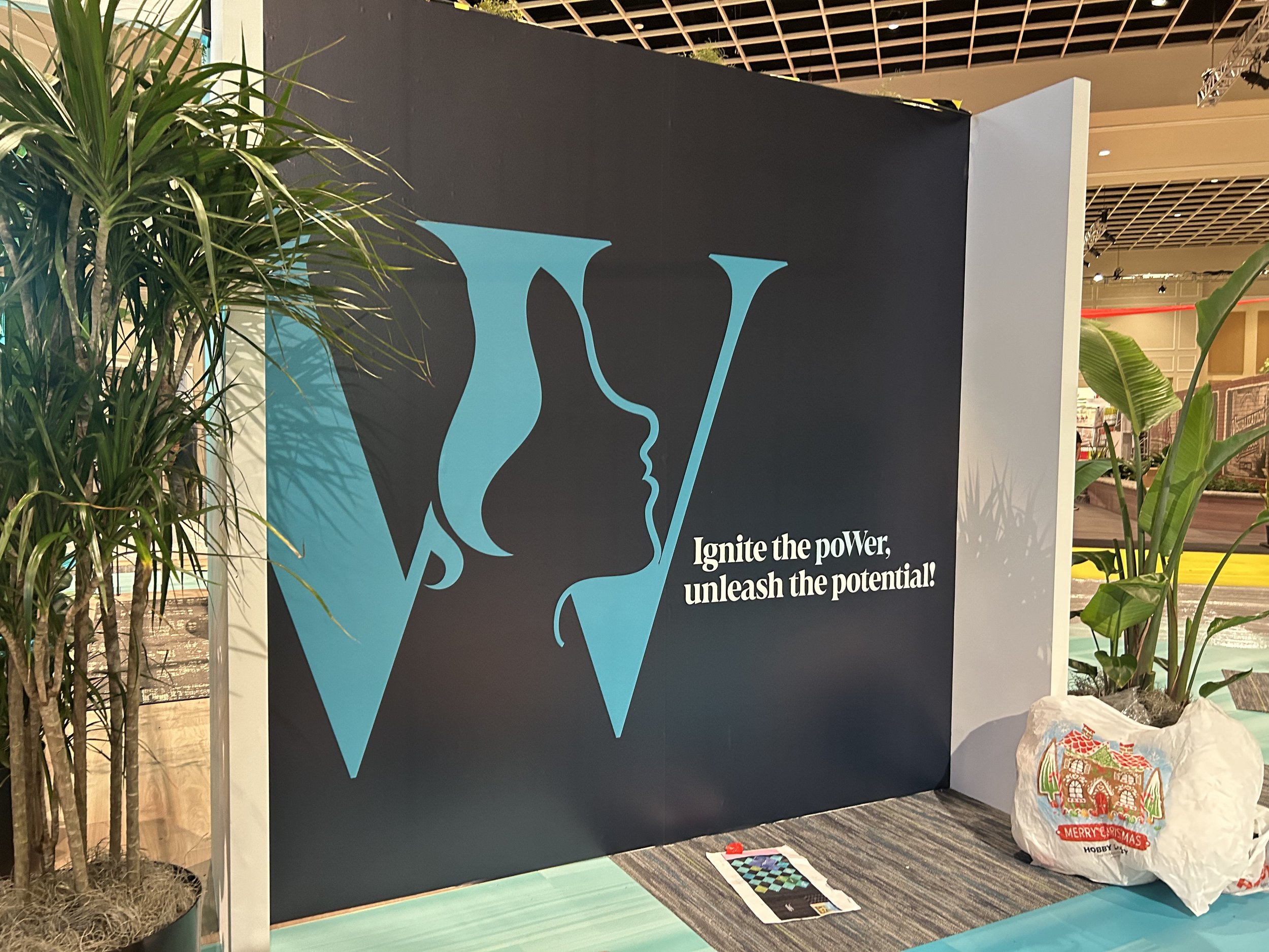
poWer
Shaw Industries, 2024-2025
Branding, Experiential Design
poWer was developed as a space for women in the flooring industry to connect! This group represents women from all over North America, spanning from all the way up in Canada to down south in Texas.
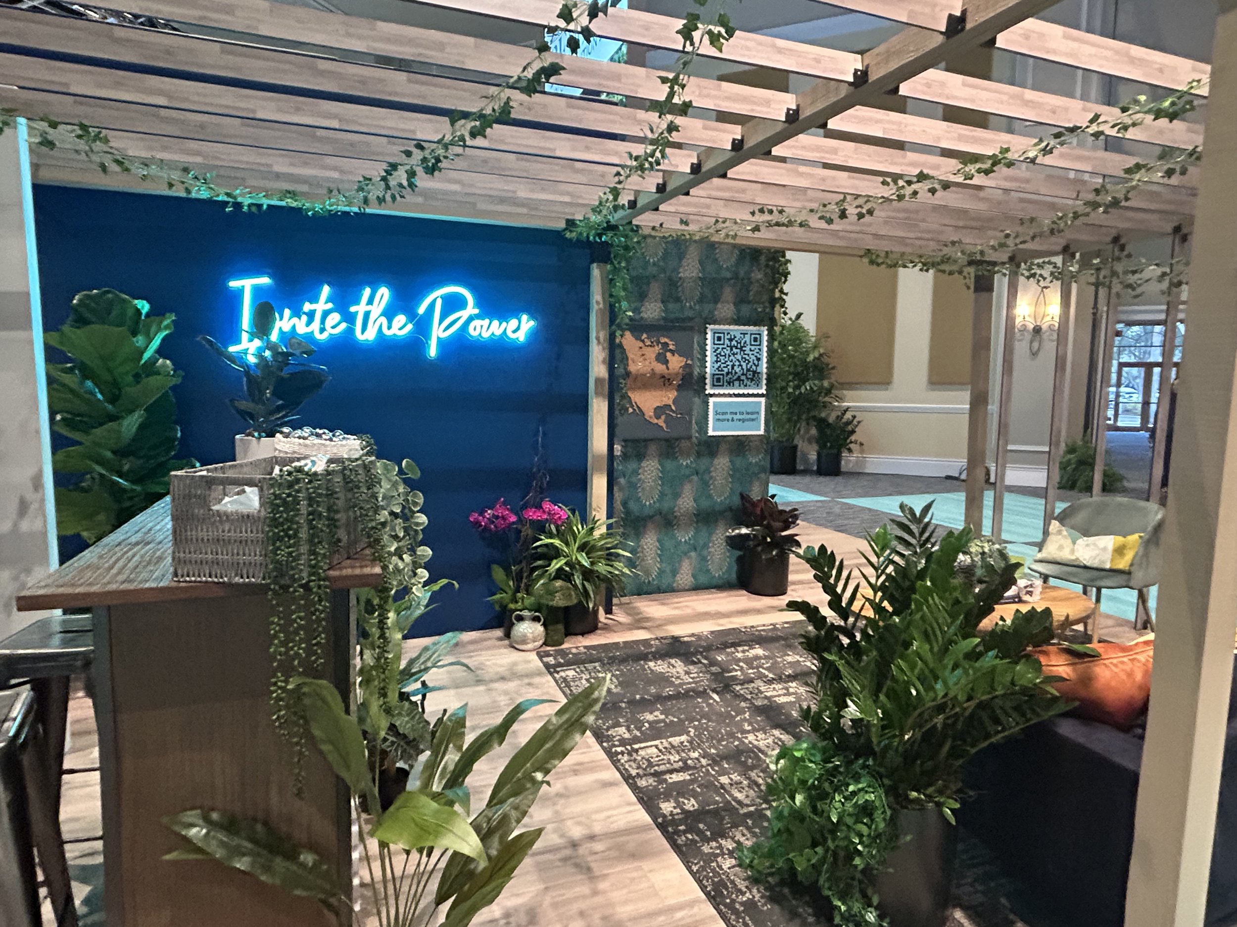
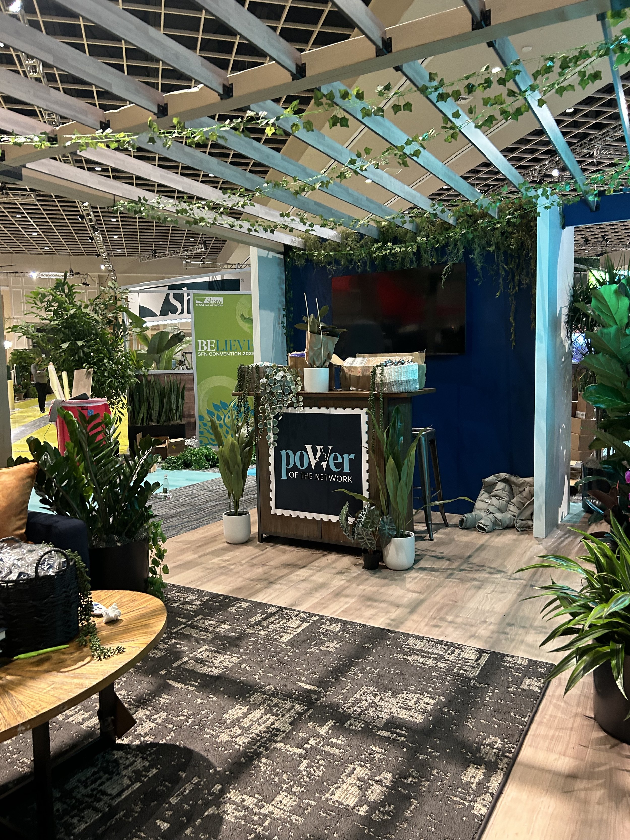
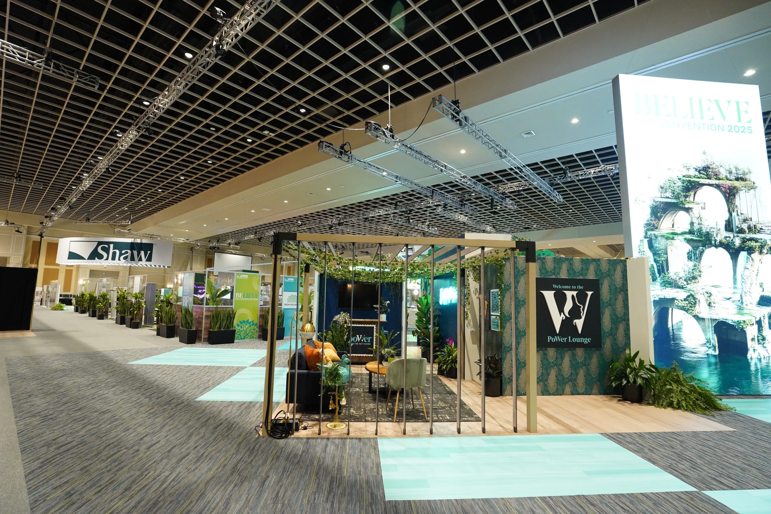
I was chosen by the Shaw corporate team to work with the flooring store owners and CEOs to develop a brand identity that fit their mission. I created a booth design for the group, working with outside vendors and some very amazing coworkers to bring the completed vision to life at the Rosenshingle Creek Convention Center.
Each piece of furniture, flooring, and wall decor was curated and handpicked carefully to match the new branding. The visual identity and booth debuted at the Shaw Flooring Network Convention 2025 to an audience of 600+ people.
The poWer of the Network
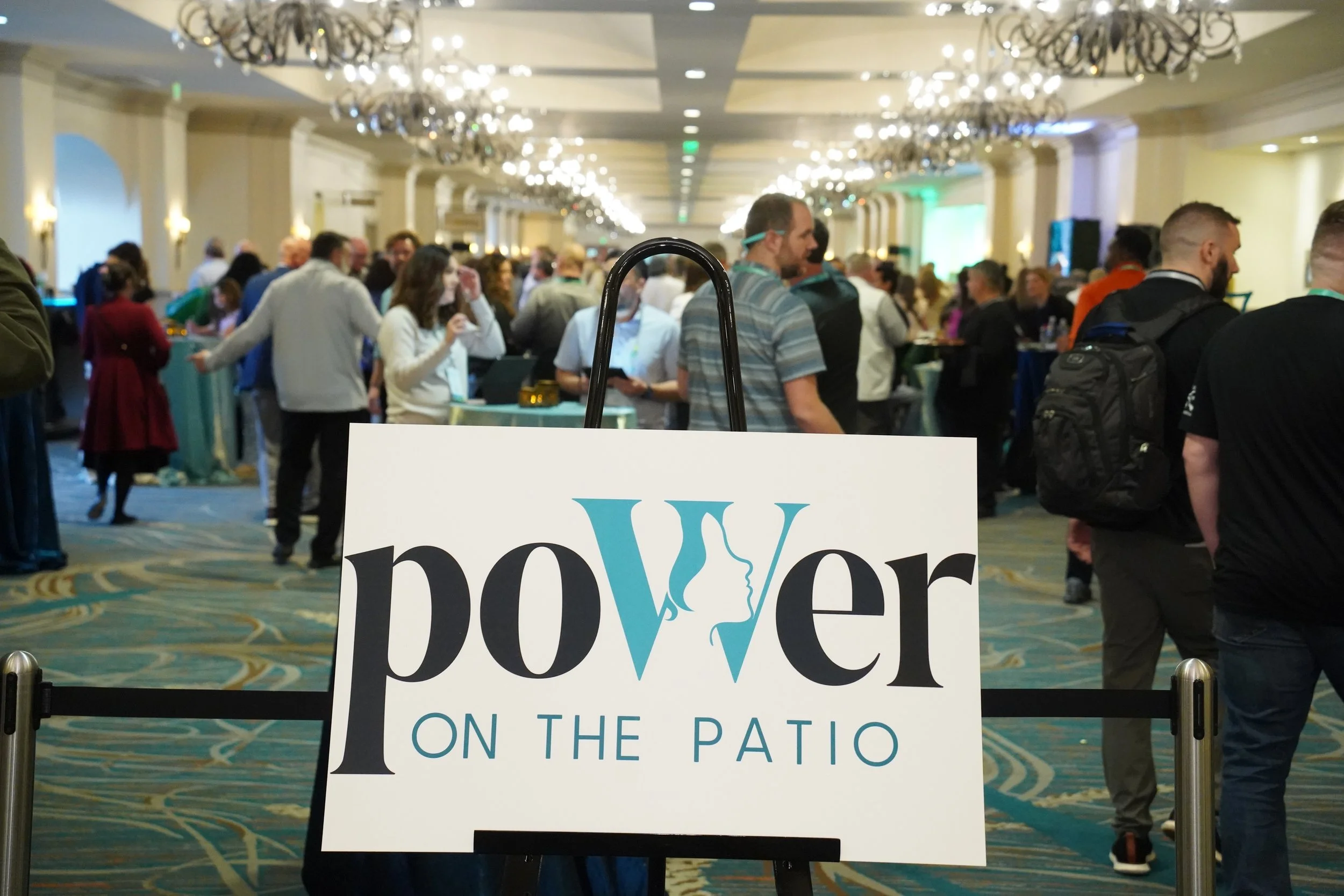
Immediately following Convention, the group garnered 500+ supporters and members. The group independently started their own newsletter, communication system, and even a podcast. I am so honored and proud to have helped Shaw provide and support this organization!


Proposed Logomarks
PROCESS WORK
Behind every logomark is rounds of revisions. This one was no exception – it was very important for all of us to capture the importance of women in this identity.
One direction we attempted was the peacock. The peacock symbolizes the creation of peacock down bedding that soon expanded into the creation of carpet textiles thanks to Catherine E. Whitener of Dalton, Georgia. While rejected in favor of a woman’s portrait and stamps being the main motif, I still find this visual identity as an homage to Ms. Whitener and the career that paved the way for women like me.
